Overview
Refresh is a food management app and rewards program that encourages individuals to reuse ingredients from previous meals by suggesting recipes based on what’s available in their kitchen.
This product was a result of a 5-day Design Sprint during our first week of bootcamp. Post-course refinement and testings were done to improve usability, as well as, adapt to current mobile devices and design trends.
Role
Sprint: User Interviews, Ideation, Asset & User Testing
Redesign: Sketching, Wireframe, Prototyping & User Testing
Sprint Team
Cathy Zhang, Przemek Jalowski, Mark Martinez
Project Length
6.5 weeks
Problem Space
The Concern
Canada is one of the largest wasters of food globally, yet majority of its residents are unaware that households are the largest contributors to the issue.
The Goal
Our team wanted to find a solution that helps mitigate food waste in households through behavioral change.
The challenge is, how do we help individuals manage and repurpose raw ingredients?
The Journey & The User
Mapping it out
To understand the problem, it was critical to identify what happens during the moment an individual realizes the need to purchase food until after it is consumed. This helps identify which moment of interaction to target and intervene.
However, not all consumers think and act the same way. Some plan ahead while others are more spontaneous. Both users had to be be considered.
Why Is There Waste?
We asked 18 participants, a mix of Spontaneous and Planners, how they managed their food at home. Through this surfaced the main reasons of wastage:
Buying in bulk due to cheaper cost per unit
Buying more than what’s needed
Negligence (“out of sight, out of mind” thinking)
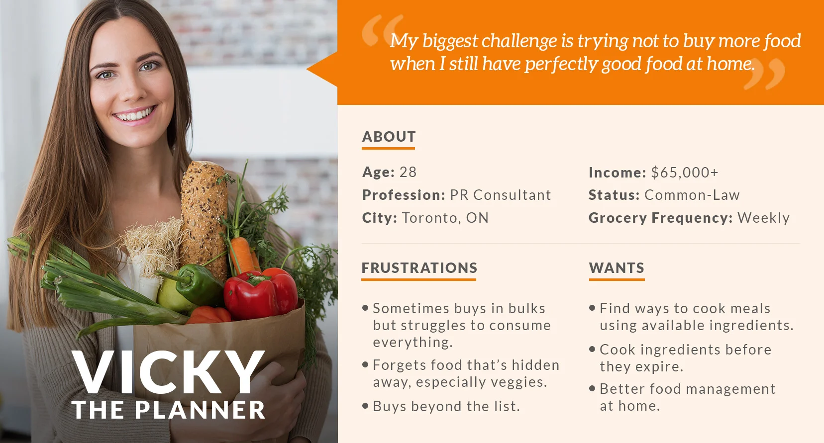
While their cooking-to-consumption experiences were identical, we decided to focus on the user with a longer planning process to cover all bases. From this came,Vicky.
Ideation
Diverge Then Converge
With a better understanding of the problem space, each team member was given the opportunity to design and present a solution to the team. Ideation was done rapidly to encourage "out of the box" thinking without dwelling too much on the details. This gave each one a chance to contribute and showcase their unique ideas. After a fair "silent voting", ideas were then merged and visualized into one cohesive product.
Solution
Refresh is a food tracking tool that helps conscious individuals cook meals that use ingredients that are already available in their kitchen. As an incentive, the more meals cooked, the more points earned. Accumulated points generate coupons which are redeemable at their affiliated local grocery stores.
This series of screens made up our original prototype which was tested to gather user feedback and presented on our last day of the sprint.
Why Coupons?
Changing ones behaviour is not easy to accomplish especially if the tasks involved (ie, inputing food items to track & cooking meals) come off like a chore. This was addressed by gamifying the experience and rewarding the user with redeemable coupons.
Redesign
Taking it a step further
Post-course at BrainStation, I wanted to refine Refresh further and challenged myself to design based on current mobile device standards and design trends.
However, there were gaps in the user flow, as well as, tasks that required too many actions in the initial design. A quick sketch of a task flow helped point out which screens to omit, merge and add.
I then iterated the design using the user testing feedbacks acquired from the sprint and conducted another round of testings to further improve the user experience.
Design Trends and Going "Bezeless"
There is a big movement in mobile devices going " bezeless" or having larger, edge-to-edge screens displays. The release of iPhoneX and iOS11 has inspired a new UI trend where headers use larger typefaces and hero images are blown up to fullscreen.
However, having more real estate doesn't necessarily mean more content can be packed on the screen. Breathing room and how a design registers on older mobile devices should be greatly considered.
Next Steps
IMPROVING THE EXPERIENCE
Ease of use while inputing ingredients has always been a concern while designing this product. Manual entry of data may still seem quite task heavy for some. Hence, a barcode scanner was added in the second iteration.
Image recognition that uses data science to assess the freshness of barcode-less ingredients, such meats and produce can potentially lessen the number of times a user taps on screen, as well as, measure shelf life with better accuracy.


